Acrylic & Alcohol Ink on High Impact Polystyrene Panel
12”x12”
This autumn aspen scene captures the warmth of fall through layered vertical forms that suggest aspen trunks rising through a cascade of amber, rust, and burnt orange foliage. The composition balances structure with atmospheric softness—white-gray vertical elements provide rhythm while stippled color creates textural depth without overwhelming the eye.
A Steller's Jay adds a subtle point of interest among the golden canopy, while a moose silhouette emerges quietly in the lower portion, grounding the piece with gentle wildlife presence. The color transitions from warm golds and terracottas in the upper two-thirds to cooler sage greens and muted blues below, creating natural depth.
The overall effect is contemplative rather than dramatic, inviting viewers into a quiet moment of seasonal transition.
This piece would work well in spaces that appreciate warmth without intensity. A reading nook or study where the autumn tones add coziness without demanding attention. Living rooms with natural light where the golds can shift throughout the day. It could anchor a bedroom that leans toward earth tones, providing visual interest that remains calm enough for a rest space.
Color palette: Burnt orange, rust, amber, golden yellow, cream, white, soft gray, sage green, muted blue-green, warm brown
This painting will ship in a simple protective frame.
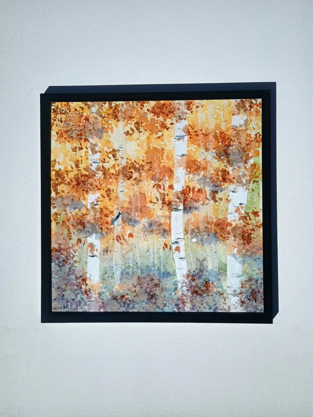 Image 1 of 4
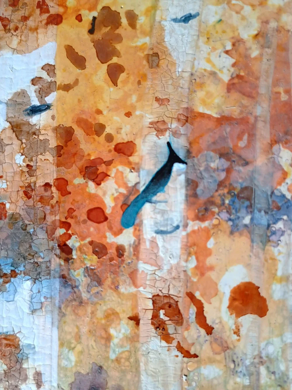 Image 2 of 4
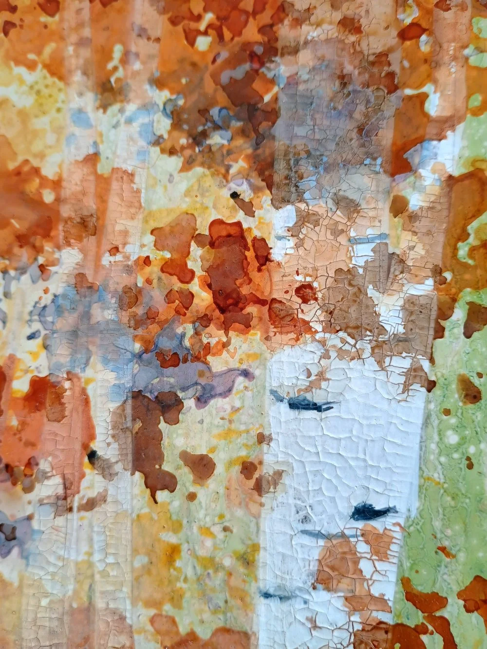 Image 3 of 4
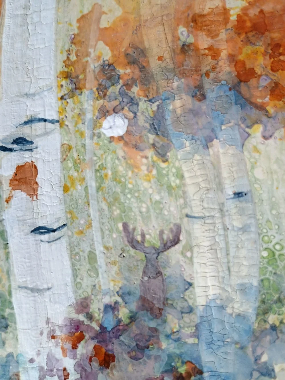 Image 4 of 4