Acrylic & Alcohol Ink on High Impact Polystyrene Panel
12”x12”
This aspen grove composition moves through distinct color zones—amber and rust foliage dominates the upper canopy, transitioning through sage and cream in the middle ground to cooler blues and purples at the base. White-gray vertical elements establish rhythm without rigidity, their bark markings adding texture while maintaining the suggestive quality of your approach. Two Steller's Jays punctuate the composition, their placement creating visual movement through the piece rather than serving as focal points.
The layered application creates atmospheric depth, with the warm autumn tones gradually yielding to cooler undertones that ground the scene. The overall effect balances seasonal warmth with spatial calm—there's energy in the color shifts and stippled foliage, but the vertical structure and muted palette keep it contemplative. The piece reads as both forest scene and color study, allowing viewers to engage with it as representation or abstraction depending on viewing distance and attention.
This work suits spaces that benefit from warmth without visual noise—bedrooms, reading areas, or offices where the cooler base tones provide calm while the autumn palette adds life. The scale works well in intimate settings or as part of a grouped arrangement.
Color palette: Burnt orange, rust, amber, golden yellow, cream, white, soft gray, sage green, blue-green, dusty blue, lavender-gray, warm brown
This painting will ship in a simple protective frame.
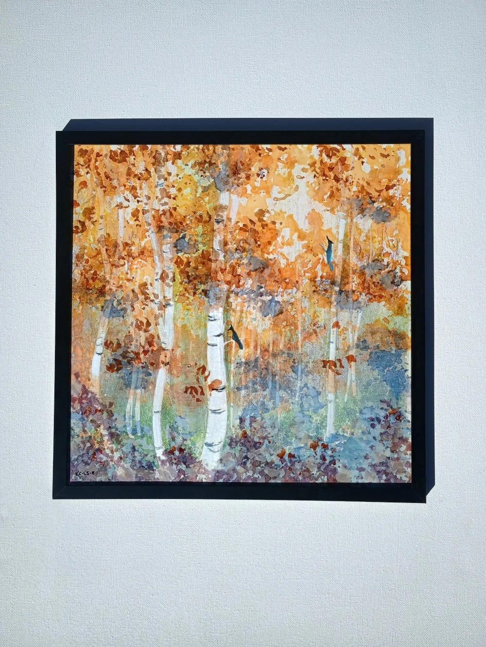 Image 1 of 4
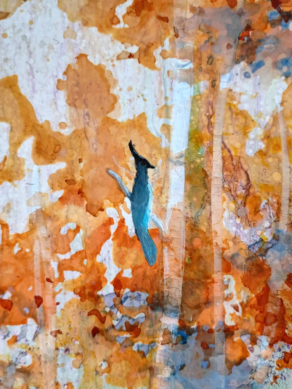 Image 2 of 4
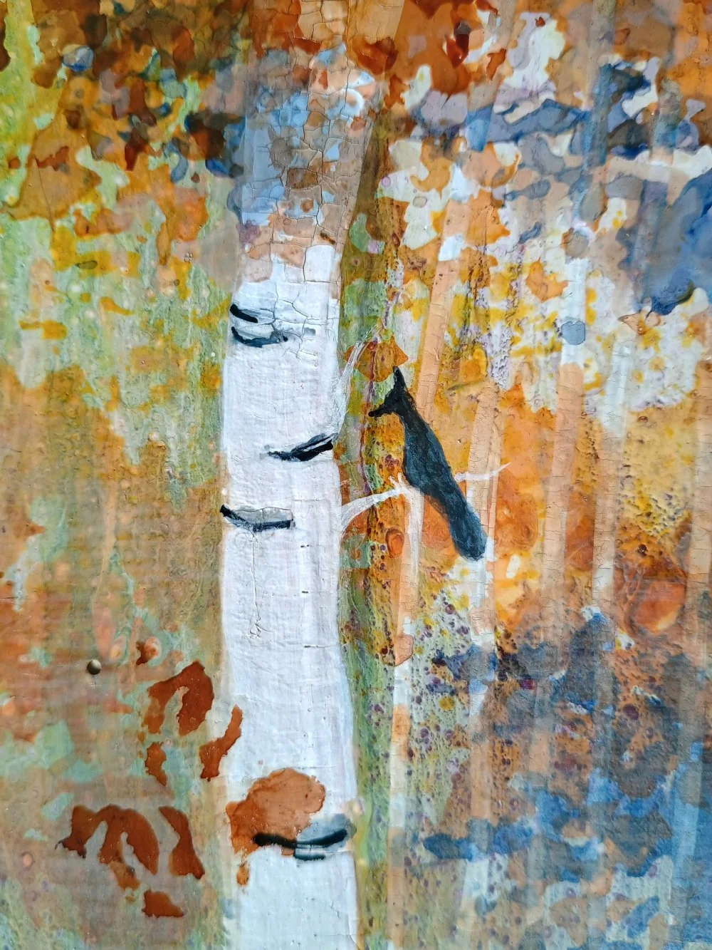 Image 3 of 4
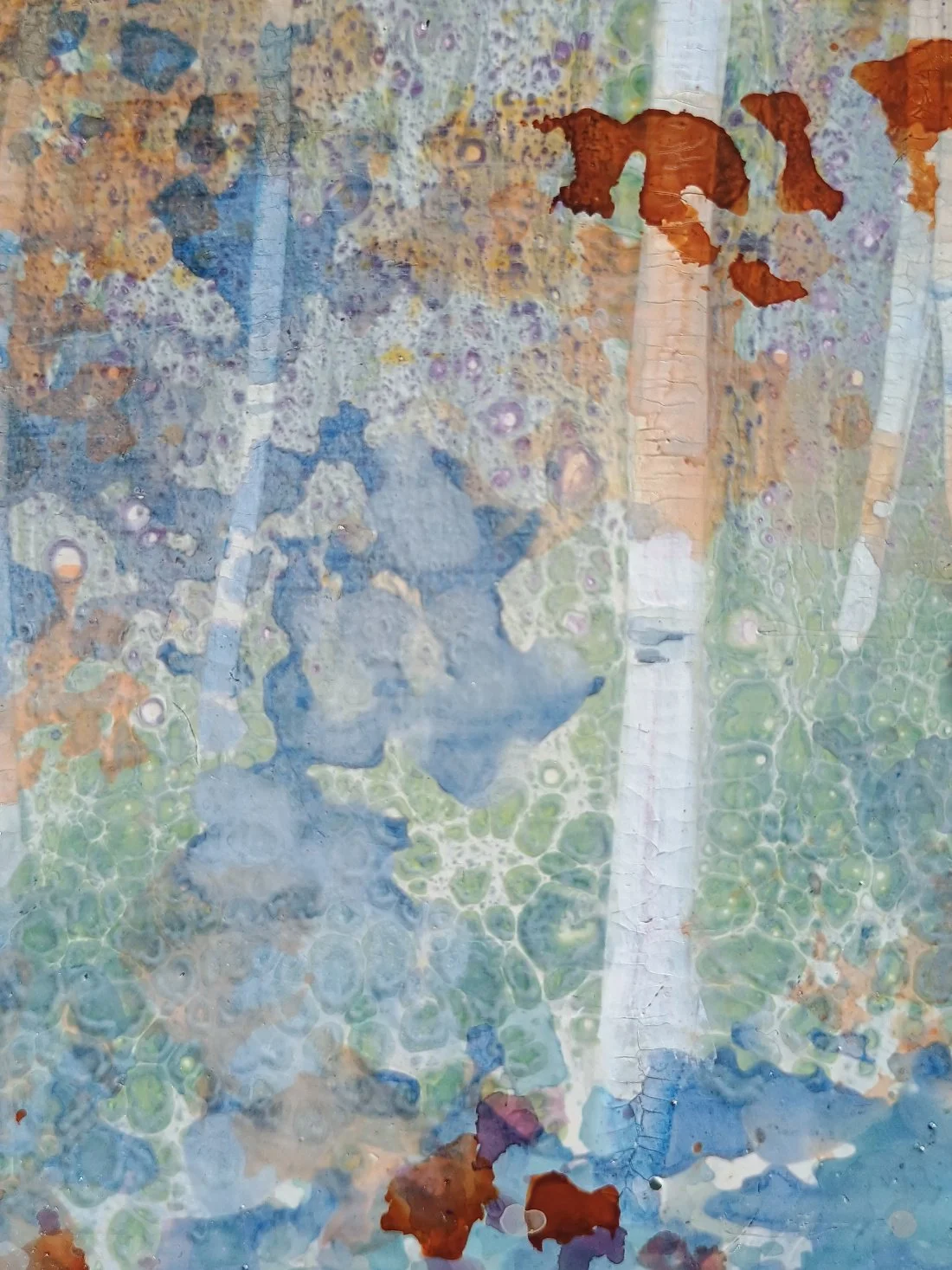 Image 4 of 4